

 Tweet
Tweet
wow an actually good sig. I think it looks awesome, good job man. 8/10
-
"Knowledge is the key to superiority"
~Diablos~
Diablos- war23/blm36/drg/27
Abyss- blm21/bst27
http://lorddiablos.proboards23.com s4.invisionfree.com/Missing_Nin_Colony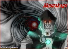
Japan@Beta
Clans: NeoGundan, TheConfederation, KnightsofRivendale -
8/10 dunno who that guy is
I gotta stop changing my avatar+sig :sweat:Comment
-
Automatic 10/10
Comment
-
What can I say man... I'm a simple white boy who thought 2Pac was a genious. I would have to give it a 9/10Comment
-
Just finished mine a little while ago, what do you think?
I'm already thinking it's too big, but the master PSD file is 1000x400 so I can change it easily. ^^~
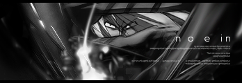
Edit: Spazz yours is fun, but pretty minimalist. 9/10 for humor factor 5/10 for fru-fru artynessComment
-
Changed the size to accord with the fourm rules on sig sizes. Below is the master file; careful it'll be a 56k no-no.
http://members.shaw.ca/cgreer11/Eles_Star_Sig_Huge.jpgComment
-
9/10
u should change ur text though, but other than that, I think its pretty cool
Comment
-
Thank you. Change the text how? Style/colour or the actual copy?Originally posted by LotusWing
u should change ur text though...Comment
-
Ugh, I'm actually bad at texts too, but I can tell that the quote u have on the bottom isn't standing out too well (hard to read) and the style is kinda bland. I'll come back to u tomorrow (hopefully)when I ask my bud what changes u could make for that sig
sry for my uselessness lol :sweat:
EDIT: oh btw u forgot to rate mine :spin:Comment
-
Oh my bad! The black and white abstract is very pleasing, but not FFXI related - but whatever. I've had a {bio}tch of a time getting any of my abstract stuff to look cool so I'll give you an 8/10.Originally posted by LotusWing
EDIT: oh btw u forgot to rate mine
PS: I'm not being spiteful with my ratings, but people rate some stuff way too high (I would have given myself a 6/10 personally)Comment
-
New sig
EDIT: oh and nice sig its pimpin 9/102 wrongs dont make a right but 3 rights make a left

Comment
-
Genuine, that new one's really nice. The colour scheme is very appealing as is the ghosted animation. 8.5/10Comment
-
Thats really nice Elesirdur 9/10. Is that a neoned tree in photoshop for the background or fireworks?
New sig and avatar~Be gentle ^_^75 Mnk Sam | 70 Drk | 40 Blm | 37 Nin Rng Thf War
Woodworking 91.9+2
ZM:Complete CoP:Complete ToAU:27Comment
-
My background is a starfield made using Greg Martin's tutorial . I've been practicing, but it's still tough to get them looking good.
Aeolus, you've got a nice character model set, but the movie filter makes it look a little too fuzzy for my tastes. Nonetheless, a cool start. 7/10
PS: No need to rate min again, I don't fish for compliments that much :pComment
-
Improved skills a bit and a new sig
75 Mnk Sam | 70 Drk | 40 Blm | 37 Nin Rng Thf War
Woodworking 91.9+2
ZM:Complete CoP:Complete ToAU:27Comment


Comment