Announcement

Collapse
No announcement yet.

New Sig Model

Collapse
X
 
  • Filter
  • Time
  • Show
Clear All
new posts

  • New Sig Model

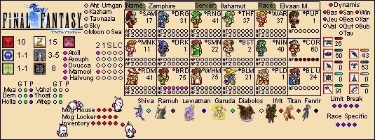
    Tell me what you guys think, I've been working on it for a while, the background is just a simple layer can be taken out easily enough and changed. I know the background makes it hard to read at certain points, but keep in mind that the circles will be filled eventually.

    Comments please, and feed back.
    Attached Files

  • #2
    Re: New Sig Model

    It looks great. Good job!!!

    Comment


    • #3
      Re: New Sig Model

      I really like it. It has a simple but unique appearance. Why are some circles white and some black? Also, Id move the Promathia down and the Bastok up, keep em sorted. But that's just me, Im a freak when it comes to even and organized. Did you try playing with the text, emboss, shadows, glow? Might make it stand out on the background a little more. Overall, I love the layout, alot less cluttered than most, but contains the same info, good job.

      Comment


      • #4
        Re: New Sig Model

        I think the circle colors are just cuz I got careless and didn't realize I was doing it. Also once those get colored in it wont make much of a differance for the color, though I will change them all to match.

        I thought about messing with embrose and things, but with text this small it tends to just make it even harder to read. Though I am thinking of useing a shadow.

        Comment


        • #5
          Re: New Sig Model

          Assualt =/= Assault

          The spacing between the second and third columns of job info aren't the same as between the first and second columns, looks a bit more cramped.

          Just little mistakes to point out.

          Also, looks like you took my idea for the 'progression bars' for jobs, ranks and craft levels

          Yours is much smaller thought, it looks neat. I just wanted to use a different font than a plain arial, but it does help with the sizing alot.

          Comment


          • #6
            Re: New Sig Model

            I'd love to use a differant font, I actually used Times New Roman with Bold and Italic, but I couldn't find another font that looked good while small. I wanted to use Mini 7 but I refuse to pay money for a font... I mean... it's a font...

            The progression bars I'm not sure if I'm actually going to use. I perssonaly don't like them but my wife does so I might use them, or much just leave them like they are now.

            Also, as my wife pointed out on mine, RA should only be 5 bubbles. When she pointed it out to me, I was like, well what about the weapon? and she pointed out that alot of jobs actually get access to 2 or 3 relic weapons, so safer just to leave it at 5 bubbles. Just thought you might want to know.

            Comment


            • #7
              Re: New Sig Model

              RA = Relic Armor, but now in the new 4 Dreamworlds (that requires CoP 3-5 done), you also get a Relic Accessory. In my Dynamis LS it's lotted like Relic Armors, so it counts as the 6th armor piece.

              Relic Weapons don't count because they drop easily enough. They are just tons hard to fully level up, so they would require a completly different progression bar.

              And alot of relic weapons can be used by many jobs, so they aren't job specefic like Relic Armors.

              Comment


              • #8
                Re: New Sig Model

                Originally posted by FranckKnight View Post
                RA = Relic Armor, but now in the new 4 Dreamworlds (that requires CoP 3-5 done), you also get a Relic Accessory. In my Dynamis LS it's lotted like Relic Armors, so it counts as the 6th armor piece.
                Did not know that.

                Comment


                • #9
                  Re: New Sig Model

                  here's my final model for now. What do you guys think? Seems a bit crowded to me, but I dont want to make it any bigger
                  Attached Files

                  Comment


                  • #10
                    Re: New Sig Model

                    As a friend told me for my model, the Outpost warps are not needed. The OPs look more like boasting fodder.

                    Info like which teleports you have, which Assault you haven't done (fix your typo, its still written Assualt), which avatar you still need to acquire... That's info that says 'help me with this if you can'. Information about which areas you can go to (Sky, Sea...) is also good to tell others that you can join their group if need is.

                    Crafting may look like boasting, but it can also be an offer to craft stuff for others if they need a hand in it. Limit Break info tells others if you're capped or not at your level.

                    So I'd take off the Outpost Warps section, and move Dynamis info into that open space instead. Might give you a bit of space to move the Avatars as well.

                    That's my two cents.

                    Comment


                    • #11
                      Re: New Sig Model

                      I see what you're saying, but the main reason I made this sig was for my wife. She thinks that a sig should be a complete repersentation of your character. It's not asking for help or anything, it's just showing everything your character has achieved and what it hasnt.

                      Comment


                      • #12
                        Re: New Sig Model

                        Then you might just want to write up a blog about all you've done, link it up in your signature, and let people go read about it.

                        I believe a signature should be giving info about you, and some personality as well. The only message that I see in outpost warps listing is that you have a bigger e-peen. Same mostly with stuff like Mog House/Locker/Inventory, because it shows info that noone else really cares for.

                        If someone wants to know if you can get to Bibiki Bay, they don't care to know if you get there using an outpost or a teleport, as long as you get there. But that you let them know that you have Sky access, current job levels, Assault restrictions, or nation ranking, that's information they can use.

                        But if all you want is boast about what you've done or not in the game, its your signature. Noone will congratulate for having all outpost warps in your signature or even showing 100 skill in Goldsmithing thought. That's where personality should be shown.

                        I'm thinking of redoing my signature for that reason, and using the one I have as a reference point instead.

                        Comment


                        • #13
                          Re: New Sig Model

                          Really good concept, but there's one main thing that bothers me. The color of the text is on top of a light-colored/white background. It may be me, but it does strain my eyes a bit just looking at it.
                          Quetzacoatl:

                          Comment


                          • #14
                            Re: New Sig Model

                            I have trouble seeing the text as well.

                            Comment


                            • #15
                              Re: New Sig Model

                              Yea, I'm in the process of trying to find a new background just havn't found one yet, it's easily changable though.

                              Comment

                              Working...
                              X