Announcement

Collapse
No announcement yet.

Signature discussion

Collapse
X
 
  • Filter
  • Time
  • Show
Clear All
new posts

  • #16
    Re: Signature discussion

    Maybe if you turn off View > Snap to > Grid it'll stop doing that. Then drag a couple guides off your rulers to help place the text and remember their positions shown in the Info window so you can put them in the same place next time.
    lagolakshmi on Guildwork :: Lago Aletheia on Lodestone

    Comment


    • #17
      Re: Signature discussion

      I'll try that next time I work on a project like this.


      Don't really wanna repeat that though. It was fun, but eh.

      Comment


      • #18
        Re: Signature discussion

        Aye, I would do the same thing Taskmage suggested. What version of Photoshop are you using?

        If I ever am turned into a rat, I want one of those wheel thingys.

        Comment


        • #19
          Re: Signature discussion

          Cs2

          Comment


          • #20
            Re: Signature discussion

            I like my sig, it makes a statement

            That statement

            "..."

            ( ' ' )b
            "I have a forebrain, my ability to abstract thoughts allow for all kinds of things" - Red Mage 8-Bit theater

            Comment


            • #21
              Re: Signature discussion

              I'd rate it if you had it.

              Comment


              • #22
                Re: Signature discussion

                koston, where were are you in your avatar and did you to anything to the shot? The lighting looks more real than what I'm used to in game ... possibly because my PC sucks.
                lagolakshmi on Guildwork :: Lago Aletheia on Lodestone

                Comment


                • #23
                  Re: Signature discussion

                  i wish i was good at photoshop @.@
                  Woodworking: 72
                  Fishing: 16
                  Smithing: 4

                  Redmage: 48
                  Blackmage: 25
                  Beastmaster
                  : 20
                  Puppetmaster
                  : 10

                  "Everyone Sucks But Me!!"
                  - Tom Brady


                  Comment


                  • #24
                    Re: Signature discussion

                    Originally posted by Daryn2889
                    I'd like some help finding a site so I can customize a sig or a site with cool sigs... Because I have none @_@ I give myself a 0/10 until I get a sig lol. Can someone please post me a good site? Preferably of Job/Race kind of things
                    http://www.deviantart.com/deviation/19834062/

                    Search around Deviant art. they have some nice tuts. If you have any questions feel free to ask me, i'd love to help

                    Double Post Edited:
                    Taskmage, what do you use to get your sig to change like that everytime?
                    Last edited by Starlight; 06-30-2006, 11:47 AM. Reason: Automerged Doublepost
                    75 WHM| 75 RDM| 75 SMN| 75 BLM

                    Comment


                    • #25
                      Re: Signature discussion

                      It's a php script Stromgarde showed me.
                      lagolakshmi on Guildwork :: Lago Aletheia on Lodestone

                      Comment


                      • #26
                        Re: Signature discussion

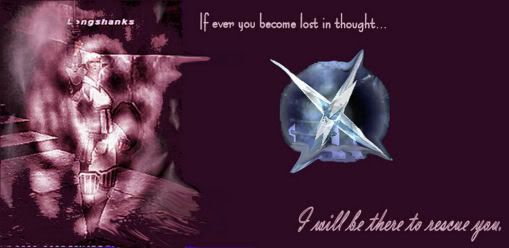
                        Ok, well I got a quote and a direction i'd like to go with a new sig

                        is what I have so far, but I can't find a pose that seems subtle yet dramatic enough, and I have NO IDEA where to go with the background (which is why it's blank now)


                        Any suggestions?

                        Double Post Edited:
                        oh, and I switched to dark skin, and I realize that doesn't show up at all on this, so open it in a new tab (if you don't use firefox you lose), or switch to light.

                        Double Post Edited:
                        actually, dark/light skin gives me an idea...


                        White text and Black text in the png would mean only one would show up at a time, unless you opened it in an image editor.. I might expand on that idea, could be fun...

                        Double Post Edited:
                        ok, made one based on my idea.


                        You'll need to switch your forum display to display both "Versions" correctly.


                        Double Post Edited:
                        ok, so I need to choose "CENTER stroke" not outside, because it messes up the font..


                        but also, in dark skin, you can see the light text, because it has a bluish tint...any idea how to fix? I'm 99% sure it was on a pure black in photoshop
                        Last edited by Feba; 07-02-2006, 04:23 AM. Reason: Automerged Doublepost

                        Comment


                        • #27
                          Re: Signature discussion

                          Feba, I like your idea of the text different, so that it appears different on each skin, but I'm not sure why the text wab blue on the dark skin. I don't use .png files much, I like to stick to JPG and GIF, but I'm going to list some possiilities:

                          1) Bits per channel. 8Bits / Channel , 16Bits/Channel
                          2) File type. JPEG files won't be transparent, try GIF.

                          Mmh, that's all I can think of at the moment. Maybe I'll think on it more once I've woken up.

                          If I ever am turned into a rat, I want one of those wheel thingys.

                          Comment


                          • #28
                            Re: Signature discussion

                            I know about transparency, i'm just not gonna bother fixing the first one for now (especially since so few people use dark skin anyway)

                            Comment


                            • #29
                              Re: Signature discussion

                              Little thing from doodling around in Photoshop:


                              Too big for a signature in that state, obviously, but I think you get the point.

                              Comment


                              • #30
                                Re: Signature discussion

                                Originally posted by Taskmage
                                It's a php script Stromgarde showed me.
                                Care to share?
                                signatures are for pussies mew mew mew, here's mine

                                Comment

                                Working...
                                X