Announcement

Collapse
No announcement yet.

new one

Collapse
This topic is closed.
X
X
 
  • Filter
  • Time
  • Show
Clear All
new posts

  • new one

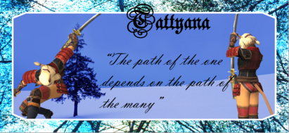
    ok so i think im getting the hang of this sig making think what do you think? sugestions? btw the shot of me with the kattana is from the viewer and i accidently made myself do hexastrike with a gkt! OMG that looked incredible!!! i wish sam had a ws that involved taht much swinging if you have view it looks REALY cool btw i dunno if this is in the right forum or not so feel free to move as needed and ill make a note of where it ends up thanks
    yay new sig!

  • #2
    Re: new one

    I like it, but I don't think the stretched-ness of it horizontally is appealing.

    Comment


    • #3
      Re: new one

      I liked the otherone better.
      -Baka Inu!
      Nejiko - Mithra Current: [ 70 THF / 35 NIN ]
      Basic Jobs: [ 70 THF / 20 MNK / 11 WHM / 18 BLM / 22WAR / 05 RDM]
      Advance Jobs: [ 04 BST / 37 NIN / 02 SMN / 05RNG / 07 SAM / 07 PLD / 00 DRK / 31 BRD / 00 DRG]
      Aht Jobs: [07 COR / 00 BLU / 00 PUP]

      Comment


      • #4
        Re: new one

        Yeah, it's a bit stretched out... you should make it smaller.

        Comment


        • #5
          Re: new one

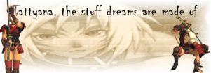
          how about this?
          yay new sig!

          Comment


          • #6
            Re: new one

            First, u need a border
            Second, u need to download better fonts (find one u like in www.dafont.com)
            Third, u need a background that isn't a render (as in not a character but a background)

            Comment


            • #7
              Re: new one

              but... i had a backround and everyone said they liked the old one better
              /sigh ok back to the drawing board......
              yay new sig!

              Comment


              • #8
                Re: new one

                lol don't get discouraged. Ur sig was MUCH better than the first/second sig I ever made.

                Comment


                • #9
                  Re: new one

                  thanks ^^ its ok i apreciate the criticisim it helps me get better! got any sugestions on where to find a backround? almost concirded a rl backround LOL i dunno ill be creative
                  yay new sig!

                  Comment


                  • #10
                    Re: new one


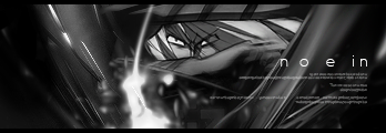
                    An example of an background I used in another thread. It doesn't have to be this detailed at first, but something like this is what u should aim for. U don't want a "picture" in it. U want to make ur own by using filter commands and brushing. See if u can get some free brushes from Deviantart. One way to get started.

                    Comment


                    • #11
                      Re: new one

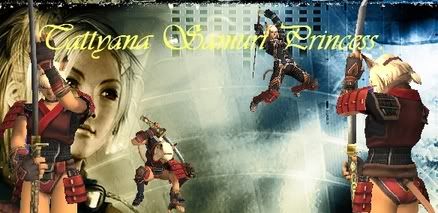
                      ok hows this?
                      yay new sig!

                      Comment


                      • #12
                        Re: new one

                        wow a huge improvement already. What "I" advise is crop out some of the image size (cut it down to 400~450 width and 100~150 height) using the crop tool, and concentrate on one render (the character). The sig gets too distracting when u have 4 characters running around in ur sig >.>

                        Comment


                        • #13
                          Re: new one

                          okay im headed in the right direction
                          wee! this is sumthing that keeps me bussy while ff is down at least
                          yay new sig!

                          Comment

                          Working...
                          X